Easy tricks (that you probably FORGET) to add personality to your brand
Visual branding used to be simple until people realized what power lies in using their lifestyle photos in marketing their business.
A few years ago - circa 2015 - online coaching World reached a tipping point and became it’s own horizontal (or vertical, depending on who’s looking) industry, and now it’s a niche that many (including myself) are serving quite happily and successfully. And for these folks (the personality-based, and not the product-based businesses) - branding became a whole new ballgame. For these folks branding with photos and videos carries more weight than anything else combined.
And now that “personality-based” brands are obsessed with what they look like in their photos, and how to bring out their best natural self - I see that most of us forget to cover some visual branding basics.
And I fell victim to this too! (Don’t feel too bad)
These basics are important and inexpensive (time+money) and I’m here to help you REMEMBER. (You can play shamanic sounds or do the singing bowls while you read this article if it helps in your transformation. I could be whispering with my eyes closed as I light a candle - “Wooo… I’ll help you remember who you really are…”)
And because I myself fell into the trap of “I’ll just let my photos to do all the talking”, and completely forgot about the things that are much more readily accessible, things that actually support the structure of your branded portraits and videos as a foundation - in your web and visual content design… because of my own “DUH” (or “AHA”) moment (again, depends on who’s looking) - I wrote these simple instructions for you to avoid that mistake. You can now make your brand smoother yet even more instilled with your personality.
I repeat - these visuals will cost you very little time and money to produce. So, maybe, just do it?
But because they’re inexpensive - it doesn’t mean that you should overlook them.
They ARE the foundation and you will want to have this foundation established.
They:
glue all your other visuals together
support your visual arsenal, and
lift your storytelling visuals to be even more accessible to the viewer, even more digestible by our tired overstimulated eyes
making you more magnetic
and providing more context to your overall brand image
As I myself go back to this foundation and start to use it more in my visuals, I’m discovering how much more fun and relaxing it is to have these tools in my branding arsenal.
Yes I said “relaxing”, because that’s how I feel when I don’t have to find all the super-duper-perfect photos to hold the “visual” weight (which is A LOT) on all my pages and graphics - I can now dilute and support them with the meaningful on-brand elements.
Here I’m giving you the list of those elements and the gist of my own creative process and how I went about it. Let’s dive in.
Patterns
Patterns are awesome when you don’t really have a story to tell or a face to show in a graphic or section (a place where you list benefits, or objections on the sales page for instance), but you want to FILL the blank space with some FEEL. FILL with FEEL. (I’m all bouncy that I came up with that.)
There are 3 layers at work here:
to uncover all the subjects that are on brand and generate ideas and find the images that can be used as PATTERNS.
to choose ONLY the ones that go with the “feel” of your brand. See below what worked and didn’t work for me.
the post-production. Changing opacity, colors and working them into the design.
For the sake of a good example - I’m going with one of my main subjects - TRAVEL.
Since selling all the things and getting on a plane across the world in Summer 2020 I’ve been told by several business besties that I must lean more into travel themes - now that I’ve got so much to show&tell in my nomadic journey.
1 year later I agreed and am ready to add “Travel” theme to my branding (talk about taking things slow). Because other than in my Instagram stories - people won’t even know that I travel! (And only like ~70 people are watching my stories. And not so regularly.)
1st thing I did was google “travel patterns”. That’s when I saw all these cartoon-ish things pop up that are all really cute, but I would probably be having spasms if someone suggested I use them on my website.

YIKES! (I almost gave up on the idea.)
I mean - they look like pajamas. And they could work for other people, but my business is more about pushing against the glass ceiling and being rebellious. I can’t use pajama patterns - can I?
The next step was to keep scrolling, (what else is there to do…) and keep waiting for an idea to come up. I mean - I’d love some cute airplanes in a tattoo on my shoulder, but anything hand drawn makes my brand feel... domestic? Tame? I feel a serious lack of seriousness here!
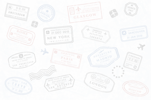
Then I saw something in those search results that reminded me of a friend posting about her passport full of visa stamps and how envious it made me feel, and I went into my favorite stock site and typed in “travel stamps”.
This is what came up right away:

Bingo! I mean - much better right?
But still not quite 100% “me”. It felt too dense of sorts, visually.
Which is why I love the feature they have in Deposit Photos when you’re looking at an image and you’re “not sure” - they have more options in their suggestions on their “select the resolution” screen:

So I saved that for my use! This is how I decided to use it - overlaid with white background, to be adjusted as needed on the page it will go onto:

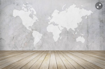
Next idea was - maps. I don’t remember where it popped up, but it was one of the images in one of the searches too.
I even saw some WOODEN maps. Being the one to create “5 Senses Framework” (at the moment being re-recorded. Signup for newsletter to hear when it’s back up!) this kinda hit the spot for me. It’s a great “touch” stimulating image.
(Map can definitely be used as a pattern. I checked with my therapist.)


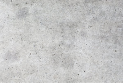
I also saw a map on a brick wall, and then on a concrete wall. Here’s the distinction between you and not-you (an example) - a brick is a lot less “me” than a “concrete”, so if I were to pick one of them - I’d pick a concrete wall with a map on it.

It’s like you’re building a perfect house for yourself. How would you build your house? What textures would you surround yourself with? (more on textures later)
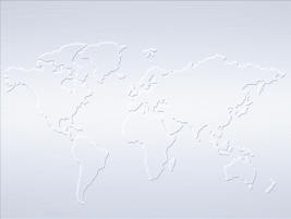
Remembering my brand’s values - SIMPLICITY and CLARITY, I want something “cleaner”. I went with the following search keywords: glass, water, metal… “clean”. Maybe even drop the metal part. Make it “clear”.
A few taps on the keyboard in the stock library and I get these ideas to save:

By the way - I save everything into “Favorites” instead of buying the stock images right away, and then when I’m designing a page - I go in and pull from that collection and edit the image as necessary to go with MY website’s and brand’s color scheme. Sometimes another image from “suggested” will be more fitting. So - don’t buy them on an impulse!
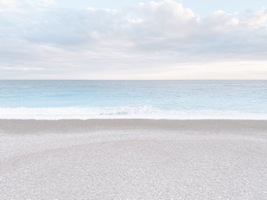
Here’s a photo I recently snapped on my 5k run on the Nice promenade - WITH MY PHONE. I ended up converting that into a background as well:

And I’ve got a whole bunch more where this one came from. Just to illustrate to you that you can create these SO CHEAPLY.
Now I have these cool backgrounds that are on brand and I can use them anytime I want to fill some big white space with “feel”:
Then I continued generating more ideas but what came is no longer related to PATTERNS.
Let’s go with the next step now.
Illustrations
I saw (or remembered) the compasses:
But I didn’t want to use the images of the real compasses. I’m not a travel site.
These great illustrations came up and I’m definitely going to use them for “punctuation”.
(to punctuate visually means the same as with copy: to create separation, to help the content flow better, increase understanding etc).

A suggestion for you would be to look into doodles! Or hiring someone to illustrate you or some meaningful subjects/objects of your brand.
I haven’t gotten to that part yet, I think I’m good for now with what I found. But I wanted to finish the “creative” process and...
Called an artist friend of mine and told her about my “travel” ideas and what I’m looking for and she added some great suggestions, which we’ll review in the next section. (Not a smooth transition, but I’m trying to save you time reading this. So…)
Photos of related props, flat lays, scenes
Here’s what she suggested (and what I thought of them as applies to my brand):
“Luggage” and “Car with the luggage on top” (this says more “vacation” to me, than “nomadic life”)
Road signs with directions (love this image! I haven’t found any that I liked, but I made a mental note to take some photos when I see a good sign/setting!)
Foot steps… and the travel shoes that have seen it all. (Saw some dead-looking “travel” shoes on stock libraries. After a thought or two - decided to go with Converse shoes. They are very “travel”. Also made a mental note to take photos of my own shoes. They def look like (and ARE) actual travel shoes and are a far better quality than Converse (look up “leather Ecco” on Amazon with whitewall sole). Shots of feet up with a killer view - things like that.)
View from an airplane including a window (may be while referring to “birds-eye view” when we’re “creating your brand”, otherwise the entire concept is too stock-y for me)
She also gave me feedback on my idea of a map - and suggested I don’t pick a vintage map. “I see that thing everywhere” - she said. Besides - vintage is not really on brand for me either.
Based on all that - more ideas came up:
A travel hat
Travel camera / camera bag
Scarves in various travel-related scenes
Here we go. I didn’t even begin getting creative yet - and I already have a great collection going.
TIP: if you CAN - use your own body parts in shots. It’s also adding more of your own personality. And don’t be shy taking photos with your phone camera!
Textures
With on-brand textures keep in mind that you’re going for the FEEL. Don’t just pick something that goes against your grain, like for me it was all that cutesy hand-drawn stuff. Or for my friend - who said - “do NOT go for the “vintage map”.
Textures stimulate the sense of TOUCH.
In my case - using a glass version of the map, using elements that are translucent, like water texture - those are my textures.

I see myself using metal and concrete in some of the elements.

(all these are found cheap on stock sites! Simply adjust to your color scheme and change the opacity, so they are not distracting from your copy/main images)
Keep in mind that travel gives me the freedom to go with pretty much anything. Travel is all about variety and exploration. So I could be a lot more liberal in my social media posts, but I want my website assets to appear clear and clean - because I use photos to help people make their brand clear - for themselves AND their audience.
I talk a whole lot about how to find YOUR brand textures in the
“5 Senses Framework” - Mini Training.
(it’s currently being re-recorded, but signup here to get news when it’s back up!)
Besides textures you’ll learn all ways to make your brand not only more personal,
but also more SENSE-ational.
And the last but not least:
Handwriting, hand lettering
I’ve not done this personally, but something easy to create is a bunch of on-brand [insert your go-to type of paper product] with hand-written quotes on them.

If you’re choosing to do this and are looking at paper types, remember what I told you about TEXTURES. Pick a nice feeling paper that will trigger more “feels” in your viewer.
Also remember that sometimes ONE WORD on a piece of paper is a powerful story enough. Like “UGH.” Just kidding!
There is probably a gazillion other ways to use hand lettering, so I’ll let your creative juices flow here, especially if you love to write. But I’ll mention that the #1 way to use your own writing is in signatures! Use signature image in emails and in articles (along with your face there) to really add that personal touch to your content.
Now all that’s left is take your saved ideas to your graphic designer and have a blast building them into your brand’s visuals! Create some background textures, create some graphics for quotes on social media.
I hope all this gives you great new ideas to make your brand more personal, to the point and more fun for your viewer to interact with.
I’d like to see what you come up with for YOUR brand!